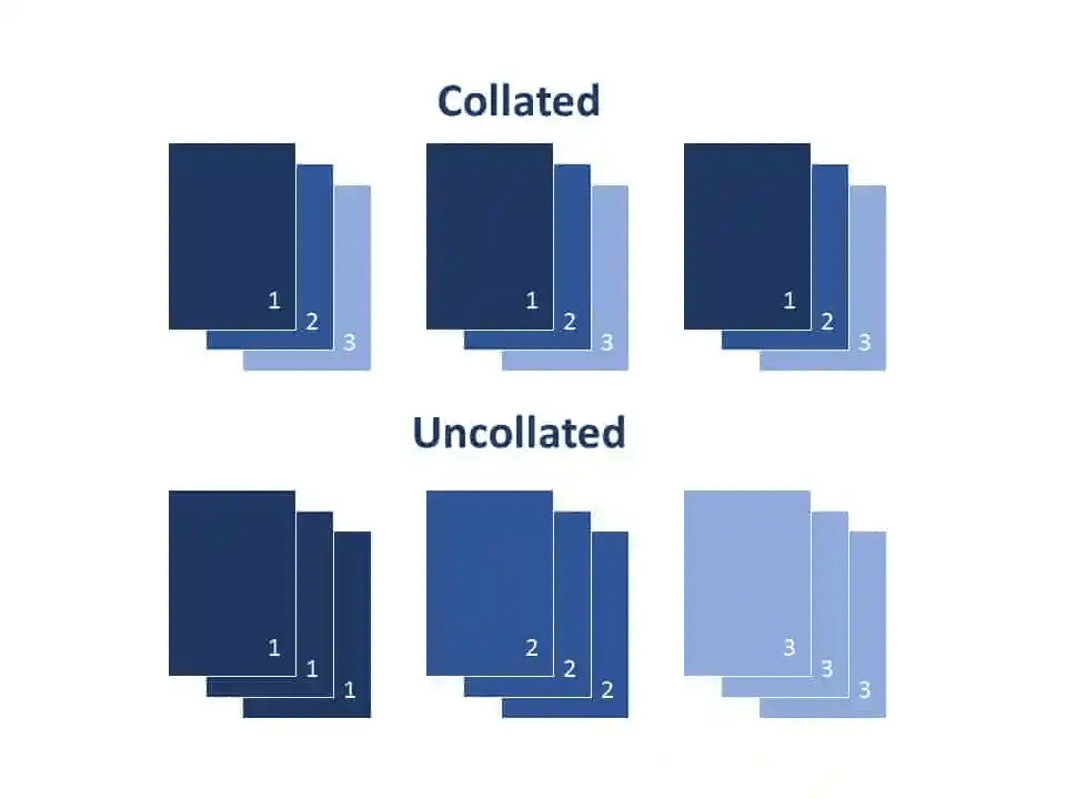
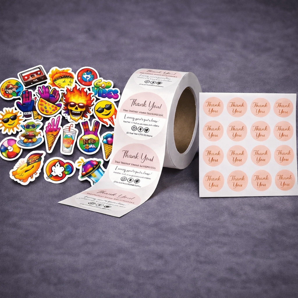
If you’ve ever ordered cosmetic labels and thought, “These looked better on my screen,” you’re not alone. A lot of people assume label printing is pretty straightforward. Upload a design, hit print, and you’re done. But once you start producing real products, especially in the skincare and beauty space, you realize there’s a lot more […]
Category Archives: Printing Tips
Common Wine Label Mistakes That Show Up After Bottling A wine label can look perfect when it comes off the press. Colors look right, alignment is clean, and everything appears ready for bottling. Then a few days later, problems start showing up. Edges begin to lift. The surface wrinkles. Labels shift slightly on the bottle. […]
Choosing between glossy and matte paper might seem like a small decision, but it has a big impact on how a printed piece looks, feels, and performs. Many people assume paper choice is just a matter of personal preference. In reality, the finish you choose affects color appearance, readability, durability, and even how professional a […]
Printing for Elections and Political Campaigns: How to Avoid Delays, Mistakes, and Last-Minute Scrambles Political campaigns move fast. Timelines shift, priorities change overnight, and deadlines are often immovable. In the middle of all that, printed materials still play a critical role in how campaigns communicate, organize, and remain visible to voters. From door-to-door outreach to […]
If you have ever printed a design that looked sharp on your screen but came out blurry or pixelated on paper, resolution is almost always the reason. DPI is one of the most misunderstood concepts in printing. Many people assume that if an image looks good on a screen, it will print the same way. […]
Choosing the right file format is one of the most important steps in getting a good printed result. It is also one of the most commonly misunderstood. Many print issues that people blame on paper, ink, or the printer itself actually start with the file format. Low resolution images, missing fonts, color shifts, and layout […]
If you have ever picked up a printed piece and thought, “That’s not the color I saw on my screen,” you are not alone. This is one of the most common questions people have when ordering professional printing, and it affects beginners and experienced designers alike. The short answer is that screens and printers work […]
If you have ever ordered something printed and noticed thin white lines along the edges, you have already experienced a bleed issue, even if you did not know what it was called at the time. Bleed is one of those printing terms that sounds technical, but the idea behind it is actually very simple. Once […]
Last Updated: March 20, 2026 How to Properly Prepare Canva Artwork for Professional Printing Designing in Canva is easy. That is exactly why so many people use it for everything from business cards and flyers to brochures, postcards, and vinyl banners. That convenience is Canva’s strength. It is also where a lot of printing problems […]
Common Printing Terms Explained: Collate, Duplex, and Other Essential Basics Understanding printing terminology does not have to feel confusing. We often get asked, what does collate mean when printing? If you have ever ordered funeral programs, graduation programs, theatre programs, booklets, or any type of multi page document, you have probably seen terms like collate, […]