Graphic Design Tips, Printing Tips
Why Your Printed Colors Don’t Match Your Screen – RGB vs CMYK
If you have ever picked up a printed piece and thought, “That’s not the color I saw on my screen,” you are not alone. This is one of the most common questions people have when ordering professional printing, and it affects beginners and experienced designers alike.
The short answer is that screens and printers work very differently. The longer answer is worth understanding, because once you know why this happens, it becomes much easier to plan ahead and avoid surprises.
This guide explains why printed colors often look different than what you see on your screen and what you can do to get results that are much closer to what you expect.
Screens and Printers Do Not Create Color the Same Way
The primary reason colors change is that screens and printers produce color in fundamentally different ways.
Screens use light. Printers use ink.
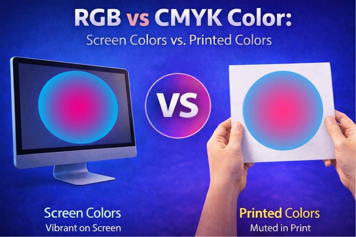
Your computer, phone, or tablet displays color using red, green, and blue light. This system is known as RGB. Colors are formed by adding light together, which naturally makes them appear bright, vibrant, and luminous.
Printers, on the other hand, use cyan, magenta, yellow, and black ink. This system is called CMYK. Instead of emitting light, ink absorbs light as it sits on paper.
Because of this difference alone, some colors that look impressive on a screen simply cannot be reproduced exactly with ink on paper.
To get a better visual idea of what this looks like, check out our RGB to CMYK Simulator tool.
RGB vs CMYK: The Core Reason Colors Change
At the heart of most color-matching issues is the difference between RGB and CMYK.
RGB color exists in a light-based environment. When red, green, and blue light are combined, colors become brighter and more intense. This is why designs often look bold and eye-catching on screens.
CMYK color exists in a physical, ink-based environment. Ink layers on paper reduce reflected light, which naturally results in colors that appear more subdued than their on-screen counterparts.
Certain RGB colors fall outside the printable CMYK color range. Bright blues, intense greens, and neon-like colors are common examples. When a file designed in RGB is prepared for print, those colors must be converted to their closest printable equivalents.
This conversion is expected and unavoidable. It does not indicate a printing error or a problem with the file. It is simply the result of translating light-based color into ink-based color.
Your Screen Is Probably Brighter Than You Realize
Most screens are set far brighter than what printed inks or toners can realistically match.
High brightness makes colors appear more vivid, more saturated, and more energetic. When those same colors are printed, they can look darker or flatter by comparison.
This is not a printer issue. It is a brightness mismatch.
Unless your screen is calibrated for print viewing, what you are seeing is an idealized version of the color rather than a realistic preview of how it will appear on paper.
Color Profiles Matter More Than Most People Think
Color profiles tell devices how to interpret and translate color information.
If a file remains in RGB and is converted to CMYK without proper color management, color shifts can occur. Blues may lean purple. Greens can lose intensity. Reds may darken more than expected.
Professional printers rely on specific color profiles to maintain consistency from design to final output. When those profiles are missing, incorrect, or ignored, results become unpredictable.
This is one of the main reasons why CenTex Printing requests print-ready PDF files for business cards, brochures, booklets, etc. with correct color settings already applied.
Paper Choice Has a Huge Impact on Color
The same ink can look dramatically different depending on the paper it is printed on.
Glossy paper reflects more light, which makes colors appear brighter and sharper. Matte or uncoated paper absorbs more ink, softening colors and reducing contrast.
As a result, a design printed on a glossy brochure will not look the same as the exact same design printed on an uncoated flyer.
Paper color also plays a role. Bright white paper enhances color vibrancy, while cream or natural stocks can mute colors slightly.
Ink Coverage and Saturation Limits Exist
Screens can display extremely bright and saturated colors that ink simply cannot reproduce.
Printers must operate within ink coverage limits to prevent issues such as smudging, poor drying, or muddy color buildup. When a color exceeds those limits, it must be adjusted automatically.
This can cause deep blacks to lose fine detail or rich colors to appear less intense than expected.
These adjustments are necessary to produce a clean, stable, and usable printed piece.
Home and Office Printers Are Not a Reliable Reference
Many people test their designs using a home or office printer and assume professional printing will match the result.
In reality, those printers use different inks, different paper, and different calibration standards. They are designed for convenience, not for precise color accuracy.
A professional printing press operates under far tighter controls and produces much more consistent results, but it still cannot replicate the brightness of a backlit screen.
Lighting Changes How Printed Colors Look
Printed materials reflect the light around them, which means their appearance can change depending on viewing conditions.
Fluorescent lighting, natural sunlight, and warm indoor lighting all influence how colors are perceived. A print viewed under office lighting may look different than the same piece viewed at home.
Screens are self-lit and maintain consistent appearance regardless of room lighting. Printed pieces do not have that advantage.
Proofing Is the Best Way to Avoid Surprises
When color accuracy is important, proofing is essential.
A proof allows you to preview how the final piece will look before full production begins. This provides an opportunity to make adjustments if needed.
Digital proofs confirm layout and content. Printed proofs show how color, ink, and paper interact in real-world conditions.
For projects where color matters, a printed proof is always the safest option.
Why Professional Printers Ask Questions About Color
When a printer asks about color expectations, paper choice, or proofing preferences, they are not being difficult. They are working to protect the final result.
Color perception is subjective. What looks correct to one person may look off to another. Clear communication helps align expectations before production begins.
Professional printers encounter these challenges daily and can often identify potential issues early, before they become costly mistakes.
How to Get Better Color Matches in Print
Printed colors will never look exactly the same as a screen, but you can get very close by following a few best practices.
Design with print in mind rather than relying solely on screen appearance. Use proper color profiles. Choose paper intentionally. Avoid extremely bright or neon colors. And when accuracy matters, request a proof.
Understanding these limitations upfront leads to better results and far fewer disappointments.
Final Thoughts
Printed colors differ from screen colors because they are created in entirely different ways. Screens emit light. Prints reflect it. When you add paper choice, ink limitations, screen brightness, lighting conditions, and color profiles into the mix, some variation is inevitable.
The goal is not perfection. The goal is predictability.
When you understand why colors change and plan accordingly, you can achieve professional, consistent results that look exactly how they should in print.
If you ever have questions about how a design will translate to print, we can help guide you before production begins. That conversation alone can save you time, money, and frustration.


