


Branding, Graphic Design Tips, Print Marketing, Style
15 Packaging Design Trends That Actually Work in the Real World
Packaging is often the first physical interaction a customer has with a brand. Long before a product is used, packaging communicates quality, values, and professionalism. While design trends change every year, not all of them translate well beyond mockups and screens.
The most effective packaging trends are the ones that look good, print well, scale affordably, and hold up in real-world use. Below are 15 packaging design trends that businesses are actually using successfully, with practical insight into why they work in production, not just in theory.
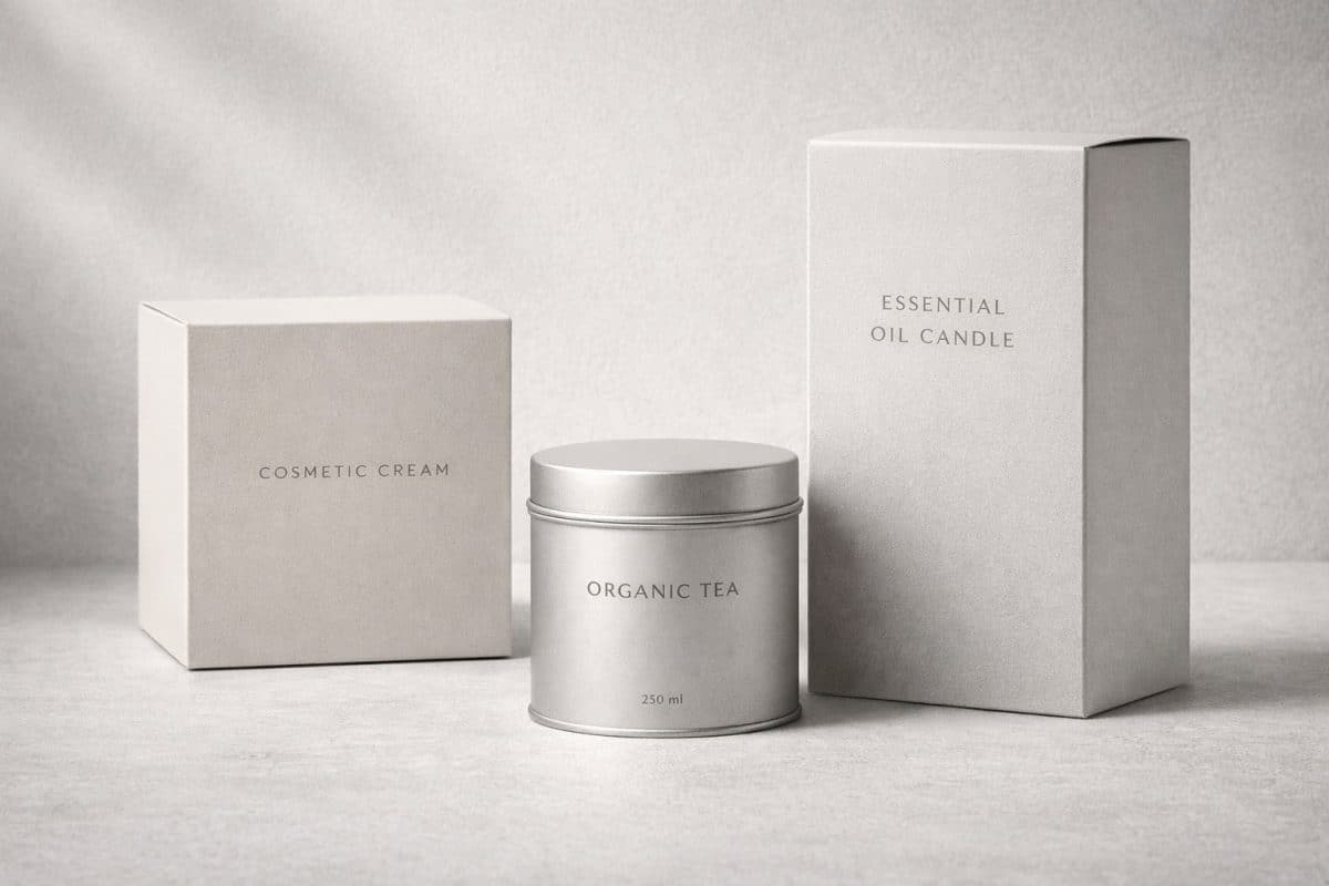
1. Minimalist Packaging That Prints Cleanly
Minimalism continues to dominate packaging design because it reduces visual clutter and improves readability. Simple layouts with intentional spacing tend to reproduce more consistently across different materials and print methods.
From a production standpoint, minimalist designs also reduce ink coverage and registration challenges, making them more reliable across short and long runs. This aligns with observations shared by Packaging World, which notes that clarity and simplicity improve both shelf impact and production efficiency.
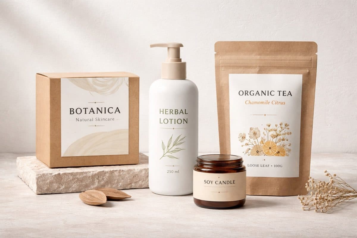
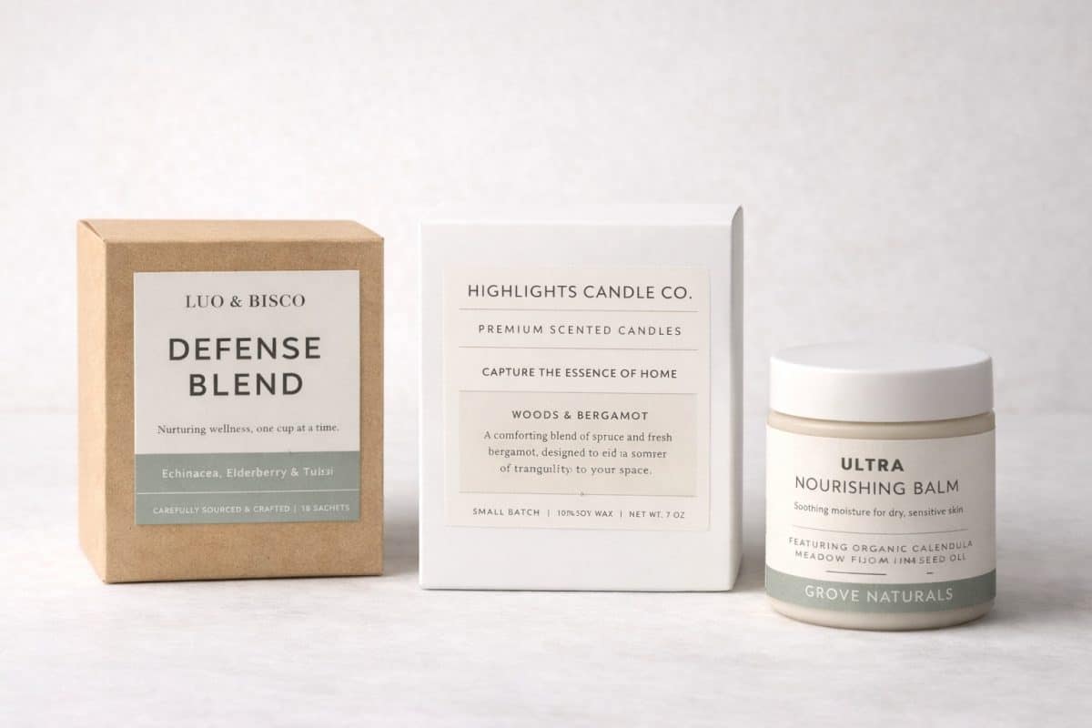
2. Sustainable-Looking Materials (Not Just Sustainability Claims)
Consumers increasingly associate sustainability with how packaging looks and feels, not just what it claims. Kraft stocks, muted color palettes, and matte finishes convey environmental responsibility even when using cost-effective materials.
Industry research from Smithers shows that brands adopting sustainable aesthetics often see improved consumer trust, even when fully compostable materials aren’t feasible.
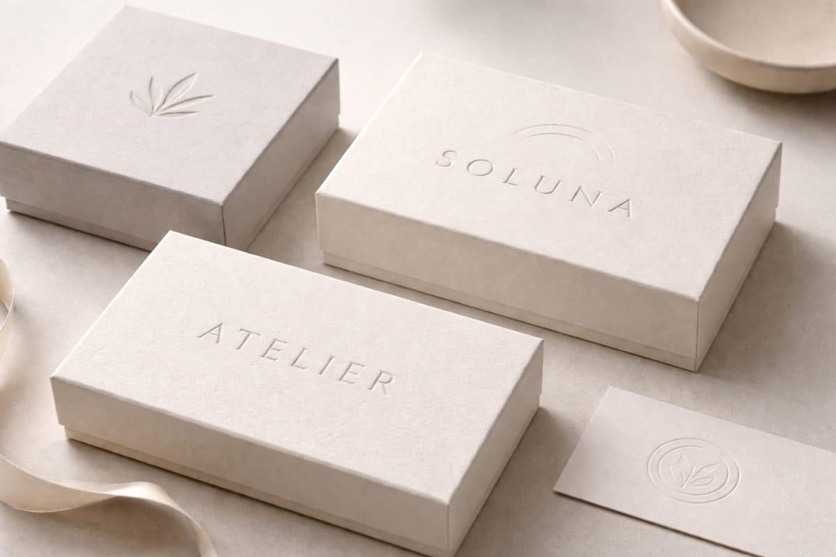
3. Subtle Embossing and Tactile Print Details
Packaging doesn’t always need more ink or more graphics to stand out. One of the most effective real-world trends is the use of subtle embossing and debossing to add depth and texture without increasing visual noise.
Rather than relying on bold colors or heavy illustration, this approach lets physical texture become part of the design. Logos, wordmarks, or simple graphic elements are pressed into the packaging material, creating dimension that’s visible through light and shadow instead of color contrast.
From a print perspective, embossed and debossed elements add tactile value without complicating layouts. These details reproduce consistently across labels, cartons, and rigid packaging when designed with restraint. They also perform well under varied lighting conditions, where raised or recessed elements remain visible even when ink coverage is minimal.
This trend works especially well for brands that want to communicate quality and intention without appearing flashy. When used sparingly, tactile print techniques reinforce craftsmanship and attention to detail; qualities customers associate with premium, thoughtfully produced packaging.
The key is restraint. Embossing works best as an accent, not a centerpiece. Small logos, short brand names, or simple symbols benefit most, allowing the packaging to feel refined, intentional, and grounded in real-world production.
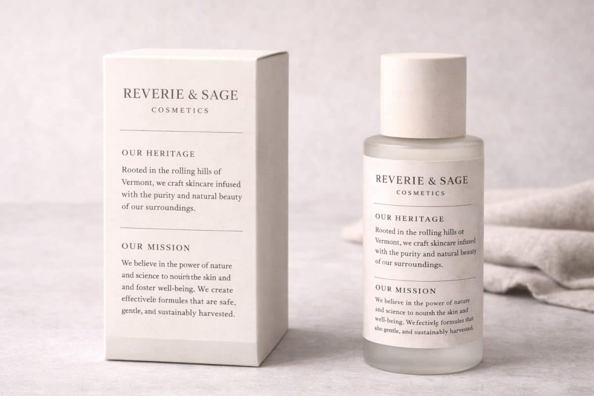
4. Packaging That Tells a Brand Story
Storytelling has moved from marketing copy into packaging itself. Short origin statements, brand values, or usage instructions help customers connect emotionally with a product.
Design trends over the last few years have highlighted the growing popularity of storytelling, but in the real world, restraint matters. Effective package storytelling is concise, consistent, intentional, and readable without overwhelming the layout.
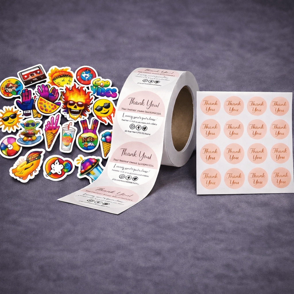
5. Small-Batch Customization and Limited Editions
Short-run packaging is no longer a limitation, it’s a strategy. Businesses are increasingly producing limited editions, seasonal packaging, or localized versions to test markets or create urgency.
Digital print technology has made this trend practical, allowing customization without massive inventory commitments. This approach is particularly effective for new businesses and direct-to-consumer brands.
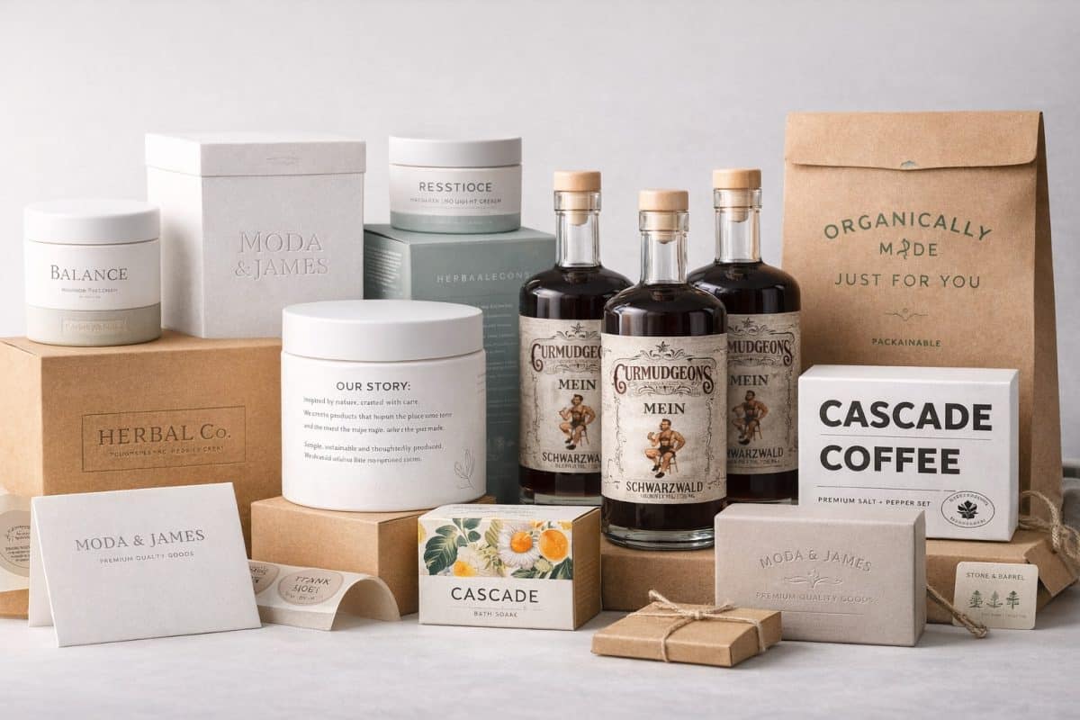
Real-World Example:
This Curmudgeons Honey Meade label is a strong example of how heritage-inspired packaging can feel authentic without appearing dated. The design relies on traditional typography, restrained illustration, and a muted color palette to communicate craft, longevity, and quality.
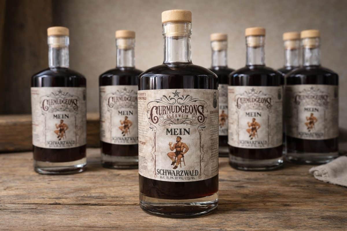
Printed with attention to paper texture, ink coverage, and color consistency, this type of packaging design reinforces the brand’s story while remaining practical for real-world production. This fast-growing brand put their trust in us here at CenTex Printing to print and help design their product labels.
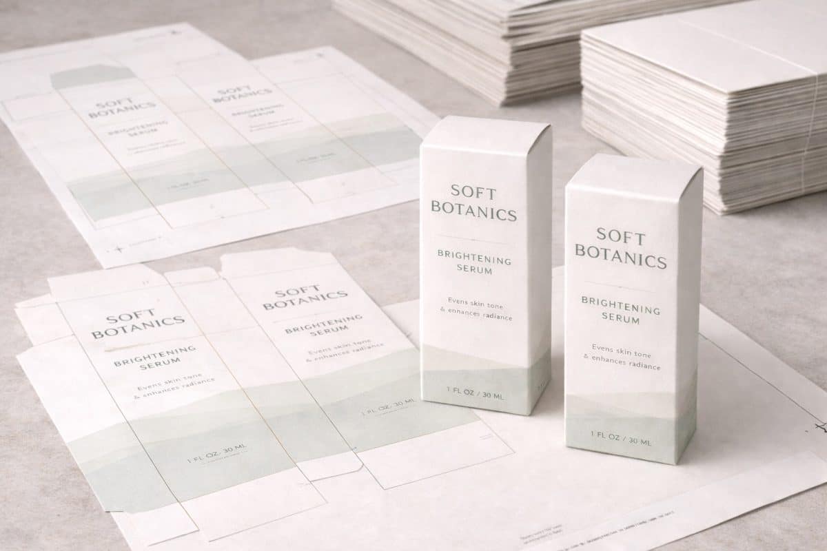
6. Packaging Designed for Short-Run Production
Designing for short runs is now a trend in itself. Packaging layouts are being created with flexibility in mind, fewer colors, modular designs, and adaptable templates.
According to insights from PrintWeek, businesses that design packaging with short-run production in mind reduce rework and avoid costly redesigns as they scale.
7. Packaging That Scales Without Redesign
Many brands struggle when packaging that works at small volumes becomes impractical at scale. A growing trend is designing packaging systems that can scale across quantities, formats, and vendors.
This includes:
-
Flexible layouts
-
Limited color palettes
-
Standardized dielines
Scalable design saves money and preserves brand consistency over time.
8. Hybrid Packaging (Labels + Standard Containers)
Rather than investing in fully custom packaging upfront, many businesses are combining custom labels with standard boxes, bags, or containers. This hybrid approach allows faster launches and lower costs without sacrificing branding.
This strategy is widely discussed in small-brand and DTC packaging communities and is especially effective for startups entering competitive markets.
9. Packaging Built for Shipping and Handling
E-commerce has changed how packaging is designed. Products must survive shipping, stacking, and handling while remaining legible and visually appealing.
This trend prioritizes:
-
Durable materials
-
Smudge-resistant finishes
-
Clear labeling after handling
Publications like WhatTheyThink regularly highlight the importance of durability and readability in modern packaging design.

10. Print-Friendly Color Palettes
Designs that rely heavily on neon, ultra-saturated, or screen-only colors often fail in print. A growing trend is choosing color palettes specifically optimized for physical production.
Print-friendly palettes:
-
Reproduce more consistently
-
Reduce proofing issues
-
Maintain brand integrity across materials
This is especially important when packaging includes both labels and printed inserts.
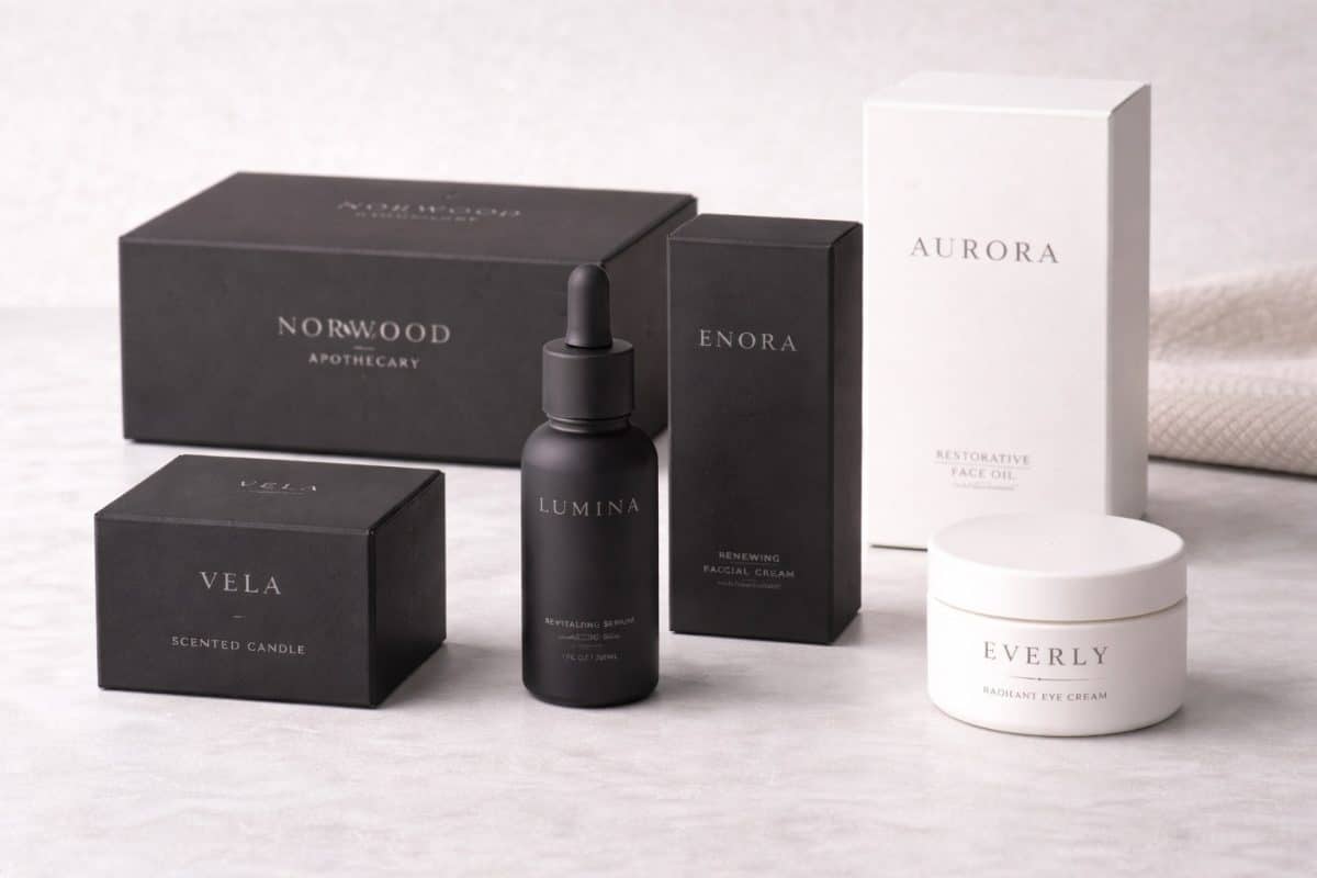
11. Matte Finishes Over High Gloss
Matte finishes continue to gain popularity due to their modern appearance and tactile quality. They also reduce glare and fingerprints, important factors in both retail and shipping environments.
While gloss still has its place, matte finishes tend to feel more premium and understated, aligning well with minimalist and sustainable design trends.
12. Clear Hierarchy and Readability
Effective packaging communicates quickly. A strong visual hierarchy, brand name first, product second, details last, improves customer understanding and reduces confusion.
This trend is supported by consumer behavior studies cited by Packaging World, emphasizing that shoppers make decisions in seconds.
13. Packaging Designed for Multiple Touchpoints
Modern packaging must work in multiple contexts: on shelves, in unboxing videos, in photos, and in hand. Designers are increasingly considering how packaging appears from different angles and distances.
This trend results in cleaner layouts and stronger brand recognition across platforms.
14. Cost-Conscious Sustainability
True sustainability balances responsibility with realism. Businesses are choosing materials and finishes that reduce waste and cost without compromising quality.
This approach aligns with Smithers’ findings that cost-effective sustainability is one of the fastest-growing priorities in packaging production.
15. Print-First Design Thinking
Perhaps the most important trend of all is designing packaging with print realities in mind from the start, not as an afterthought.
Print-first design considers:
-
Material limitations
-
Ink behavior
-
Finishing options
-
Production efficiency
This approach prevents surprises and ensures packaging performs as expected in the real world.
How Professional Printing Supports These Packaging Trends
Trends only succeed when they’re executed correctly. Professional printers help businesses adapt modern packaging designs to real-world production by ensuring:
-
Designs are optimized for print
-
Colors reproduce accurately
-
Materials match the intended use
-
Packaging scales efficiently
This collaboration reduces waste, saves time, and produces packaging that works, not just looks good.
Final Thoughts
Packaging design trends come and go, but the ones that last are grounded in practicality. The trends outlined above succeed because they balance aesthetics with production realities, cost considerations, and customer experience.
For businesses building or refining their packaging, the goal isn’t to chase trends; it’s to choose the ones that actually work in the real world.