


Printing Services
Designing Player Banners for Football, Baseball, and Basketball
Player Banner Design Guide: Creating Standout Banners for Football, Baseball, and Basketball
Player banners have become one of the most recognizable elements in school athletics. Walk into almost any stadium, ballfield, or gym and you will see them lining fences, walls, and entrances. Some look sharp and intentional. Others feel rushed or inconsistent. The difference almost always comes down to design.
A good banner is not just a photo and a name. It is a combination of layout, color, contrast, and material that works together to create something that looks professional from a distance and still holds up close.
Each sport has its own personality, and the design of your banners should reflect that. What works for football will not always work for baseball. What looks great in a gym may fall flat on an outfield fence.
Let’s walk through how to approach player banner design for football, baseball and softball, and basketball, focusing on what actually makes each one work.
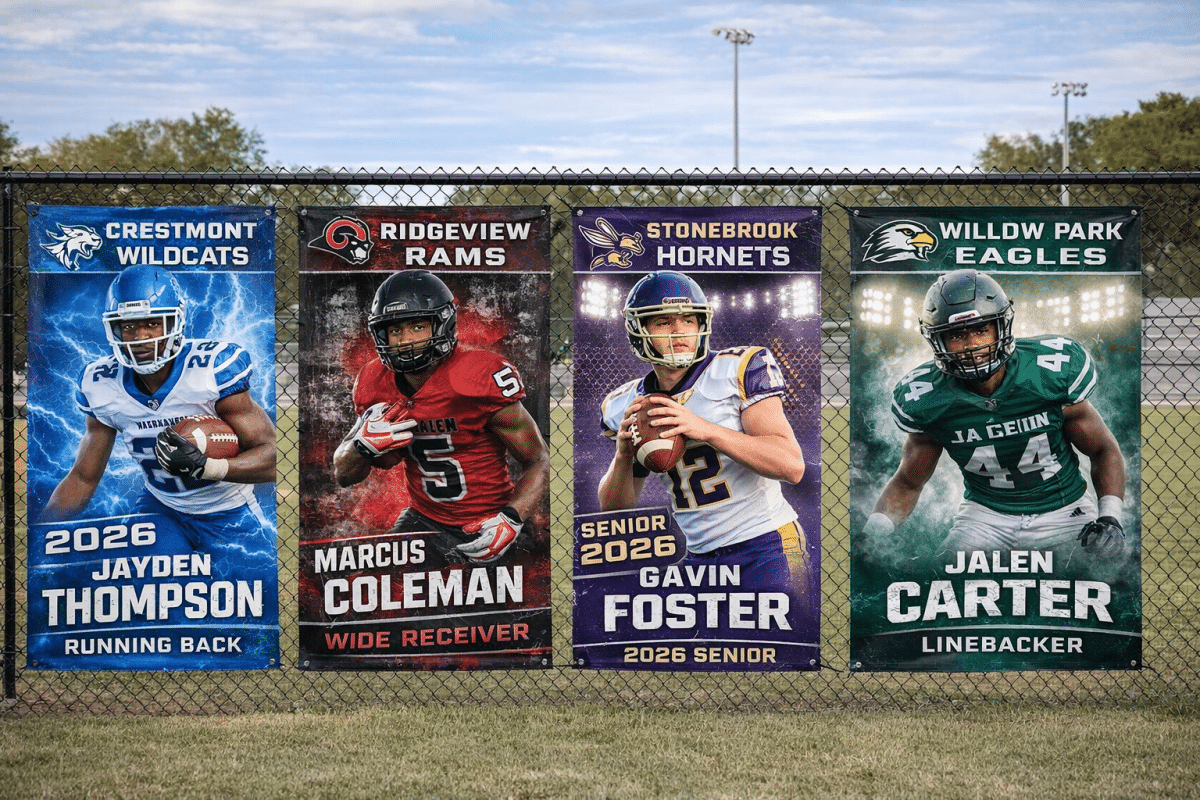
Football Player Banner Design: Bold, Aggressive, and Built for Distance
Football player banners are the most visible and, in most cases, the most impactful. They are viewed from a distance, often under stadium lighting, and surrounded by movement and noise. That environment demands a design that is strong, clean, and easy to read.
The biggest mistake people make with football banners is overcomplicating them. Too many effects, too many colors, and too much detail can actually make a banner harder to see.
Designing for Visibility First
Football banners need to be readable from across the field. That means every design decision should support visibility.
High contrast is critical. Dark backgrounds with bright text or bright backgrounds with dark text tend to work best. Mid-tone combinations often fade into the background under stadium lights.
Typography should be simple and bold. This is not the place for thin script fonts or overly stylized lettering. Block fonts with strong weight hold up better at a distance and in photos.
Spacing matters more than most people realize. If the name, number, and position are crowded together, they lose impact. Give each element room to breathe.
Common Football Design Styles
There are a few styles that consistently perform well for football banners.
Aggressive sports graphics are the most popular. These often include elements like smoke, lighting effects, textured backgrounds, and bold color overlays. When done correctly, they add energy without overwhelming the player image.
Clean modern layouts are becoming more common. These focus on strong typography, minimal background elements, and sharp color blocking. They tend to photograph well and feel more polished.
Team color dominant designs are always a safe choice. Using primary and secondary school colors as the foundation keeps everything consistent across the roster.
The key is consistency. Every banner in the lineup should feel like part of the same set. Mixing styles across players makes the display look unorganized.
Image Selection and Placement
Full-body images work best for football. They give the banner presence and help fill the vertical space effectively.
Action shots can look great, but they need to be high quality. A blurry or poorly lit action photo will hurt the overall design. If the image is not strong, a clean posed shot is always the better option.
Cutting out the player and placing them over a designed background is standard practice. This allows more control over the final look and helps unify the banners across different photo styles.
Baseball and Softball Banner Design: Clean, Traditional, and Balanced
Baseball and softball banners live in a different environment. They are viewed for longer periods of time, usually from a closer distance, and often in natural light.
Because of that, the design approach shifts. You are not competing with stadium lights and large crowds in the same way. Instead, the goal is to create something that feels clean, balanced, and consistent across the entire field.
Let the Field Influence the Design
Outfield fence banners become part of the field’s visual identity. That means the design should complement the environment rather than fight against it.
Greens, browns, and neutral tones often work well because they blend naturally with the field. That does not mean everything needs to be muted, but overly aggressive designs can feel out of place in this setting.
A balanced layout is more important here than in football. The viewer has more time to take in the banner, so alignment, spacing, and proportion all become more noticeable.
Common Baseball and Softball Styles
Traditional layouts are the most widely used. These feature a clean player image, clear text, and minimal background elements. They are easy to read and age well over time.
Diamond-themed designs are also popular. Subtle elements like field textures, chalk lines, or infield patterns can add depth without distracting from the player.
Light texture overlays can help prevent the banner from feeling flat. The key is subtlety. If the texture becomes the focus, it is too strong.
Some programs lean toward a more modern look, but even then, the designs tend to stay more restrained than football.
Handling Multiple Banners on a Fence
One of the unique challenges with baseball and softball banners is that they are usually displayed side by side along a long stretch of fence.
This makes consistency even more important.
Every banner should:
-
Use the same layout
-
Follow the same color structure
-
Maintain consistent spacing and proportions
If one banner looks significantly different from the others, it stands out in the wrong way.
Image Style Considerations
Both posed and action shots work well for baseball and softball, but they should be consistent across the team.
Mixing heavily edited action shots with simple posed images can create a mismatch.
Framing should be similar for each player. This keeps the lineup looking clean and intentional rather than random.
Basketball Player Banner Design: Clean, High Contrast, and Space Aware
Basketball player banners are all about adapting to space.
Unlike football fields or baseball fences, gyms have limited and often inconsistent areas for display. Lighting can vary, backgrounds can be busy, and viewing distances are usually shorter.
Because of that, design needs to be tighter and more controlled.
Designing for Indoor Lighting
Gym lighting is not always ideal. It can create glare, shadows, and uneven brightness.
High contrast is still important, but it needs to be balanced. Extremely dark backgrounds can absorb too much light, while very bright designs can reflect glare.
Matte-looking designs with controlled contrast tend to perform best.
Simplicity Wins in Smaller Spaces
Basketball banners are often viewed from closer distances. That means small details are more visible, but it also means clutter becomes more obvious.
Clean layouts with clear hierarchy work best.
The player should be the focus. Supporting elements like logos and text should enhance the design, not compete with it.
Common Basketball Styles
Modern minimal designs are very effective in basketball settings. These often use strong typography, simple backgrounds, and sharp color contrast.
Bold graphic styles can work, but they need to be scaled appropriately. What works on a large football banner may feel overwhelming in a gym.
Monochrome or limited color palettes are sometimes used to create a more refined look. This can be especially effective when paired with strong lighting and high-quality images.
Placement Challenges
Because every gym is different, placement varies.
Some banners hang high on walls or rafters. Others are placed closer to the floor or near entrances.
Design needs to account for where the banner will be seen. If it is placed high, larger text and simpler layouts are better. If it is closer to eye level, more detail can be included.
Creating a Cohesive Look Across All Sports
While each sport has its own design style, there should still be a level of consistency across your program.
This does not mean every banner needs to look identical, but there should be a shared visual identity.
Keep Core Elements Consistent
Across all sports, try to maintain:
-
The same primary fonts
-
Consistent use of school colors
-
Similar logo placement
-
A recognizable layout structure
This helps tie everything together and makes your program look organized.
Avoid Overdesigning
One of the most common issues across all sports is trying to do too much.
More effects do not equal better design.
Strong banners are usually built on:
-
Clean layouts
-
Clear typography
-
Thoughtful use of color
-
High-quality images – Not sure if your images and logos are high enough resolution? Check out our DPI & Image Resolution Simulator
If everything is bold, nothing stands out.
Think About Longevity
These banners are often used for an entire season and sometimes longer.
Trendy design elements can look dated quickly. A clean, well-structured design will hold up much better over time.
Final Thoughts
Player banners are one of the most visible ways to represent your athletes and your program. When they are done well, they create a sense of pride and professionalism that people notice immediately.
Football banners should feel bold and powerful.
Baseball and softball banners should feel clean and balanced.
Basketball banners should feel controlled and intentional within the space they occupy.
The goal is not just to make something that looks good on a screen. It is to create banners that perform in real environments, hold up over time, and present your athletes in the best possible way.
When you approach design with that mindset, the difference is obvious.